Brand Obama Wins “Marketer of the Year” for a Different Kind of Brand

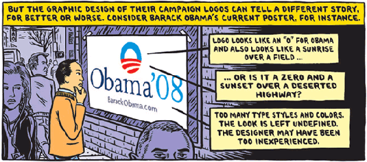
Illustration by Ward Sutton
My take on brands (which I hope someone will just once call “the Wieneke proposition“) is that brands are vessels that hold the good feelings generated by experiences created by staff or products. The implication is that those experiences have to be placed in front of the brand. Brands don’t create their own love; experiences do.
Typical brand doctrine seeks “consistency and repetition to build identity.” Plenty of brands would defend their marks, even against friendly use, to prevent genericization. OK, political brands are transient, but still I expect the engagement that Obama’s malleable brand has generated will be echoed by more established brands.
Indeed, “trademark holders” may benefit by thinking of themselves more as brand managers. If so, the challenge of managing a brand when it’s in the hands of social advocates will require tools and people skills that go way beyond “cease and desist” letters or filing DMCA takedown notices. Nobody wants legal harassment to be associated with their brands except, apparently, for certain parts of the record industry.
OK, on to the cool links.
Ad Age’s Marketer of the Year
In its annual voting by hundreds of brand directors and agency heads, Obama gained 36% of the votes for best branding, besting Apple, which received 27%, Nike’s 9%, and after a few others, McCain at 4.5%.
An Interview with the Designer of the Obama O
Sol Sender is the graphic designer who designed the Obama O logo. The candidate encouraged supporters to start their own websites, to host their own events, to make the campaign their own. Artists, Pumpkin Carvers, even Marching Bands did just that.
They Made it the Hardest-Working Logo
That’s how the New York Times describes the “O” logo in a long post. Like the Apple, the O is fun.
There was a time when enthusiasts loved the Apple Logo beyond recognition. I was part of just such an effort, which incorporated the Apple logo as wings on the Batman movie logo. Our legal department actually printed a disclaimer on the shirt describing its intention at parody speech and explaining the design’s meaning. Back then, the Apple branders grinned and asked for extra copies of the shirts.
Reading Tea Leaves and Campaign Logos
If you enjoyed the illustration at the start of this post, take a look at illustrator Ward Sutton’s thoughts on fifteen recent campaign logos. He stakes out some bold positions with a great eye and editorial tone.
One of my favorite brands has been the Cooper Mini. There’s a great deal of overlap between the values of optimism, unconventionality, and personality between the two. Both certainly inspire their zealots, which is perhaps the highest praise for brands.

 The future of digital experiences will be built by strategists who grasp the full array of emerging business, social, and technical models. Specialties in user experience, branding, application design, and data science are laying the foundation for richer user experiences and business models breakthrough products and revenue based marketing.
Comments are closed.