Not Delight: Ham Handed CPA Website Makes Saving Seem Dirty
 I don’t go looking for bad ads. They lie in wait for me.
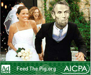
This morning The Boston Globe home page had a banner ad with a beaming bride running off with a groom, his head had turned in to Lincoln’s, and this all happened over the words, “Feed the Pig.” Huh?
Tell me if I’m way off base, but since the groom seems to the ad’s protagonist, I started to wonder if it was suggesting the bride was somehow the pig needing to be fed. Who would use this weird mix of symbols as their entry experience? What is feed the pig?
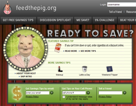
Well the poor woman getting hitched to a black and white cutout of Honest Abe is a pitch for the American Institute of Certified Public Accountants (AICPA) new public service website “Feed the Pig“. It is hosted by is a walking, talking, creepy yet smug piggy bank named Benjamin Bankes. The site is targets young “career starting adults” (25-32 years old) to remind them to fill their piggy banks and save.
Their problem isn’t really the choice of an unnerving spokesperson. The site fails because it doesn’t raise the audience’s aspirational motivation to save. Rather it jumps to tactics, like “buy your smokes online.” Come on, CPA’s, is that your best opening tip?

Other nuggets include “use cheaper beauty supplies” and “camp when you travel.” In order to have a culture of ownership, American’s need a saving mentality. Not a pig reminding them to get their smokes online, or to drink a water with their beer so they order fewer drinks.
Is the Use of the Pig Cursed from the Start?
Perhaps there are just certain symbols that one should think twice about before you base a campaign on them. In this blog I’ve advocated avoiding connecting brands to death or pedophiles…so pigs are definitely less destructive that these. Even so, they do ad a cultural risk to your work.
Yes, decades ago people saved in piggy banks. But the symbol is overshadowed by the pig as a cultural symbol of waste. There are larger cultural forces at work here than banks. Jewish and Islamic cultures view the pig as unclean and they are forbidden to eat pork. Buddhists consider the pig a sign of ignorance.
Edgy Can Work.
Consider Rip the Drip, the maladjusted spokeperson at Wasting Water is Weird. That’s the Environmental Protection Agency’s WaterSense website. He is at once funny and repellant. But this revokes his license to be preachy. Likewise, the chaotic spokes-villain Mayhem promotes Allstate Insurance as a hero. He doesn’t pontificate about the need for insurance. Yes, there are jerks in this world, so get some insurance. That’s a good message.
Edgy Doesn’t Matter It Doesn’t Sell
Just as edgy suicide themed ads failed to sell Pepsi Max, Feed the Pig fails to drive demand for saving. The US Treasury made a website that makes money look cheap, here the CPA’s have made a website that links saving to pigs more than its links it to success.
That’s what this site is missing – a much needed aspirational connection between earning, saving and success. It’s not what we make, it’s what we keep.
Without the connection of saving and success, a pig telling me how to get cheaper smokes doesn’t make we want to save. It makes me want to shower.

 The future of digital experiences will be built by strategists who grasp the full array of emerging business, social, and technical models. Specialties in user experience, branding, application design, and data science are laying the foundation for richer user experiences and business models breakthrough products and revenue based marketing.
2 Responses to "Not Delight: Ham Handed CPA Website Makes Saving Seem Dirty"
October 7, 2024
Perhaps there are just certain symbols that one should think twice about before you base a campaign on them. In this blog I’ve advocated avoiding connecting brands to death or pedophiles…so pigs are definitely less destructive that these. Even so, they do ad a cultural risk to your work.
October 8, 2024
You got to feed the Pig!!