And the Winner Is .. Dueling iPad Apps at the Oscars
 Certain private cultural events are licensing catnip. The Olympics, The Kentucky Derby, college football Bowl games, political party conventions — perhaps even The Running of the Bulls in Pamplona, or the Ig Nobel Prize Awards — they all have brand value.
Such reputations are gold that brand managers build, and they’re what trademark and copyright lawyers protect and license. And in the future, digital marketers from multiple stakeholders will have competing online applications to bring their group’s special perspective to the event. It will absolutely be a new area for licensing.
Consider the Academy of Motion Pictures Arts and Science’s (AMPAS) Oscar Awards. This year it was also the ABC network’s Oscar Awards Broadcast. Cultural magazines such as Vanity Fair devoted entire issues to it. And each outlet provided its own iPad application.
![]()
 AMPAS owns the brand, and therefore a ton of data, archival footage, and artifacts from the event’s history. And even though they’re new to hosting applications, as the license holder of the trademark and its intellectual property, they can cut whatever deal they want around sharing “application rights.”
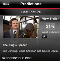
The Academy’s free app was a meticulous overview of the categories, with detailed profiles of nominees and promotional clips of the films. It was also a social app in which you could form invitation-only groups, share your picks for winners, and see standings of how your predictions stacked up against others. And then these statistics showing which entries the app audience favored were added back to the nominee profiles. You could watch this race at a data level. Expect to see the same tricks in college basketball’s March Madness and fantasy sports apps.
Though an iPhone app, it scaled well to fill an iPad screen. There were occasional data delays during the show, but it worked well, and in my opinion, it was probably the most valuable app during and heading into the event.

 The Broadcaster
While the Academy owns the brand, ABC owns the event’s production. And that’s what their app focused on. They provided a “backstage” experience by leveraging video cameras around the theater and backstage. As a geek, my preferred view was from the control room. But if you were there for the star power, you could see what was happening in the awards hall during commercials. Hey, wait: doesn’t ABC want us watching their ads? Perhaps that’s why they charged a buck to download the app. Or, more likely, it was a chance to experiment with paid premium content.
Either way, backstage fun had limited appeal, and there was little social layer to engage me beyond viewers. I saw the backstage views as a novelty. But the app actually was more useful the next day in recalling show moments. After all, ABC owns the broadcast, and talking over the watercooler the next day, that’s what people are focused on.
 The Publisher
Finally, Vanity Fair also mounted a iPad app, but it was far from an “also-ran” application.
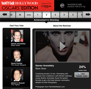
Though they are perhaps the least-franchised of the three stakeholders, from a design and integration perspective, I believe they provided the best overall application. Vanity Fair‘s design was the most social, encouraging visitors to connect with their friends via Facebook, and to share and consume buzz on multiple networks.
And their magazine publishing chops shine through in their application design, which is immediately engaging. The app is focused on making, keep score, and sharing “your picks.”
And once you’ve made picks, the app encourages you to share them more actively. Vanity Fair was the most social of the three. I could imagine someone using this at an awards-watching party. If you’re looking for application design inspiration, this should be your first stop.

 The future of digital experiences will be built by strategists who grasp the full array of emerging business, social, and technical models. Specialties in user experience, branding, application design, and data science are laying the foundation for richer user experiences and business models breakthrough products and revenue based marketing.