The Gap’s Logo Debacle is 99 Design’s Triumph
 Logo contest firm shows how easy it is to make a better logo
Judging from the fuss on Twitter, a change to a retailer’s logo can make a big difference in perception.
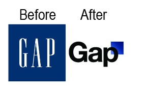
Last week, Gap swapped its traditional blue logo with a new Helvetica logo on a white background pictured here. It reminds me of BASF’s logo. It is so generic that it looks like it was laser-printed onto template stock in the early ’90s.
After outcries from customers, Gap replaced its new logo with the former blue square design.
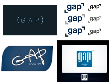
The scrappy and quick-thinking design contest firm 99 Designs made hay from this situation by challenging site visitors to showcase how they would re-design Gap’s logo. Dozens of designs were submitted, some of which I’ve pictured below (and seem far better suited to the brand).
I imagine a CMO, an agency, and many PR staffers have been in crisis mode at Gap. Meanwhile, my hat is off to 99 Designs, who turned this self-inflicted crisis into an opportunity to showcase how it can come to the aid of even large and better-known brands.
If you’re a small, scrappy business, there’s much to admire about a firm that can inject relevant and creative examples of their value into a market conversation.


 The future of digital experiences will be built by strategists who grasp the full array of emerging business, social, and technical models. Specialties in user experience, branding, application design, and data science are laying the foundation for richer user experiences and business models breakthrough products and revenue based marketing.
4 Responses to "The Gap’s Logo Debacle is 99 Design’s Triumph"
October 21, 2010
Not for nothing but even the other designs you posted aren’t much to look at. Nothing creative. If GAP was looking for a media frenzy, they got their additional 15 minutes right in time for pre-holiday business. However, if I saw those other designs, I would wonder what beginner made them. So GAP, if it ain’t broke, why fix it? Stick to what works. You are one logo that should never change.
February 12, 2011
I don’t think any high profile global brand can successfully change their logo. They would need to do it in conjunction with a merger or complete restructuring. Also, in case you did not know, 99 Designs is right across the street from the Gap in SF (ok, and down a block) and I suspect they both plotted this out before hand, with no real intention to go with any new logo.
August 28, 2012
[…] they rolled out the biggest refresh to their corporate logo in 20 years, and it reminded me of the Gap’s logo debacle. Both were irrelevant, and artless to the point of […]
July 19, 2015
Hope to see you there, come play the new set! Bring your friends!!Feb. 11 Friday 5:30pCasual Draft (2x Besieged, 1x Scars), beostor packs prize support depending on attendance, entry fee $15Compleat Strategist by BU.